Case study · B2B SaaS · Web

One list system for the whole platform

How a backend performance fix became a redesign of every list: faster to build, easier to navigate, and ready for accounts with hundreds of campaigns.

RoleDesign lead
Team · 8 people
APKTSJOGVVKYSQA
Time to ship a new list screen
2 weeks → 3 days
Active accounts using custom views
35%
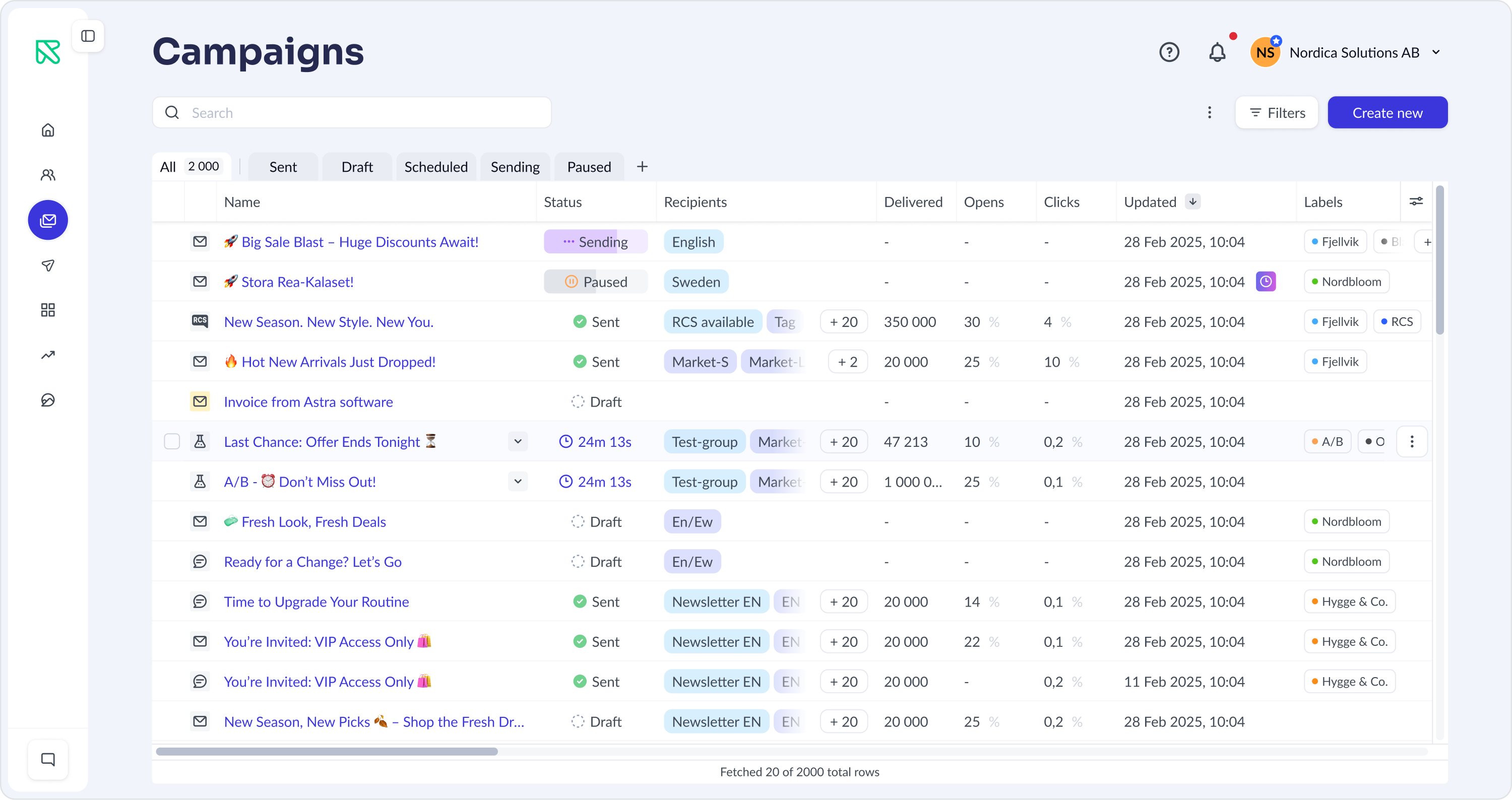
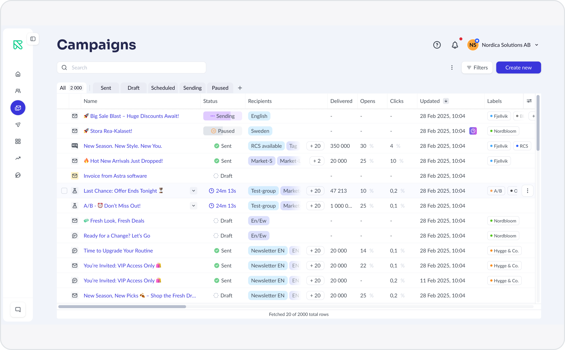
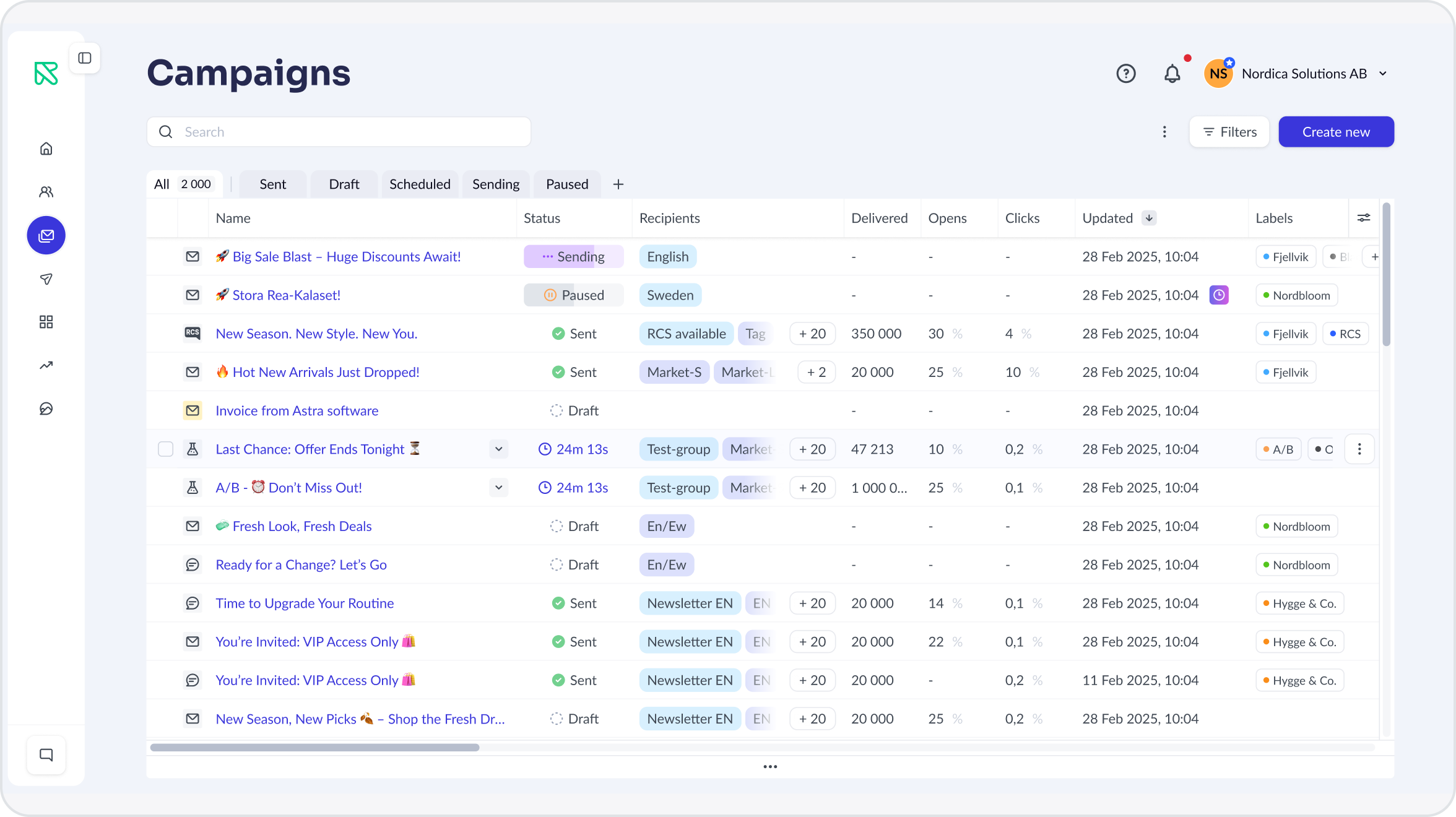
Campaign list on the new list system
The challenge

Slow lists, rebuilt for every screen

A backend team started fixing slow endpoints. We saw the chance to rethink what the lists could do, not just how fast they loaded.

Business

Performance

Large accounts with hundreds of campaigns hit performance issues, and support tickets raised the alarm.

Product

Missing functionality

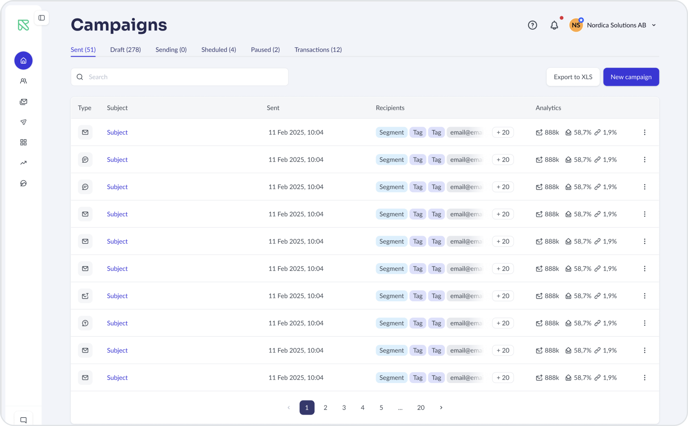
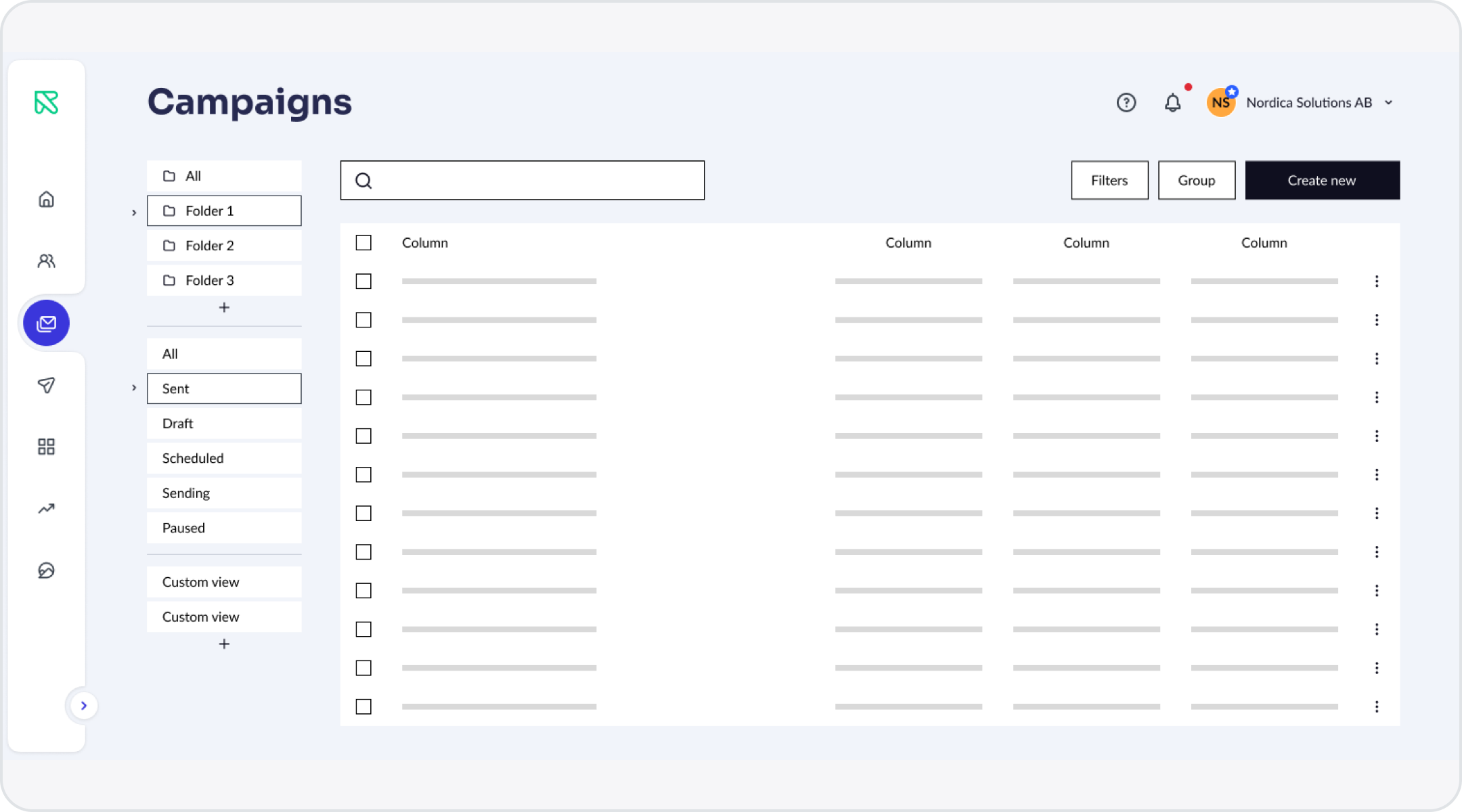
Pagination, search, rigid tabs and one action at a time. Without remembering a campaign’s name, users couldn’t find it.

Business

No reuse

Every list was custom-built with its own tabs, search and filters, so each new list started from scratch.

BeforePagination, rigid tabs, one campaign at a time.
AfterOne system: views, filters, bulk actions, customisable columns.
Research

Research with the people closest to the problem

01

1:1 interviews

30-minute open conversations with key customers of different sizes.

02

Internal workshop

With customer support and customer success, the teams who talk to users every day.

03

Competitor review

Main competitors’ lists, to learn from their mistakes and do better.

Seven clusters of needs

01Viewport-fitting table
02Filters and single-criterion sorting
03Real-time fuzzy search
04Custom views
05Table customisation
06Bulk actions and optimistic updates
07Global labels
Design decisions

Five decisions, five trade-offs

01

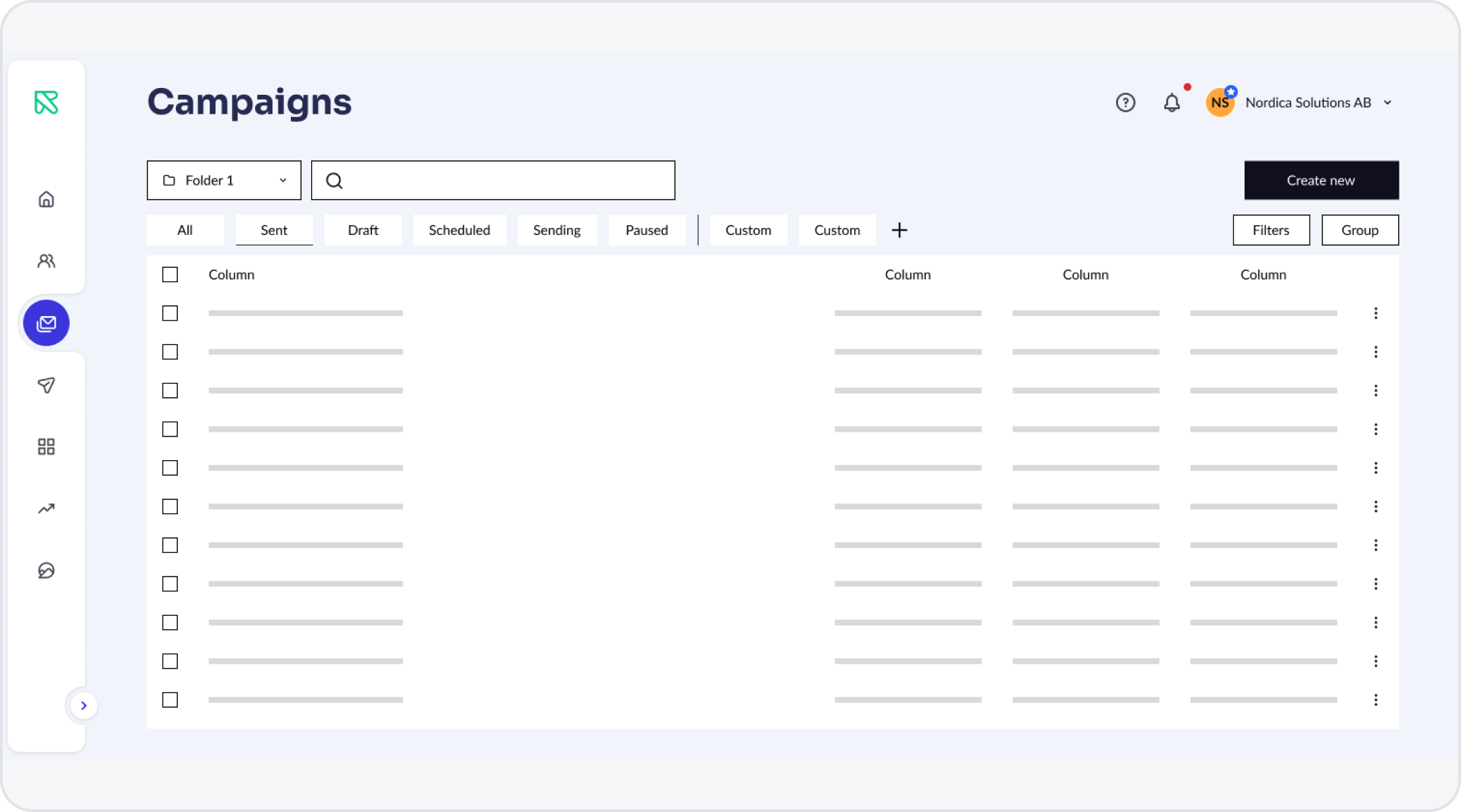
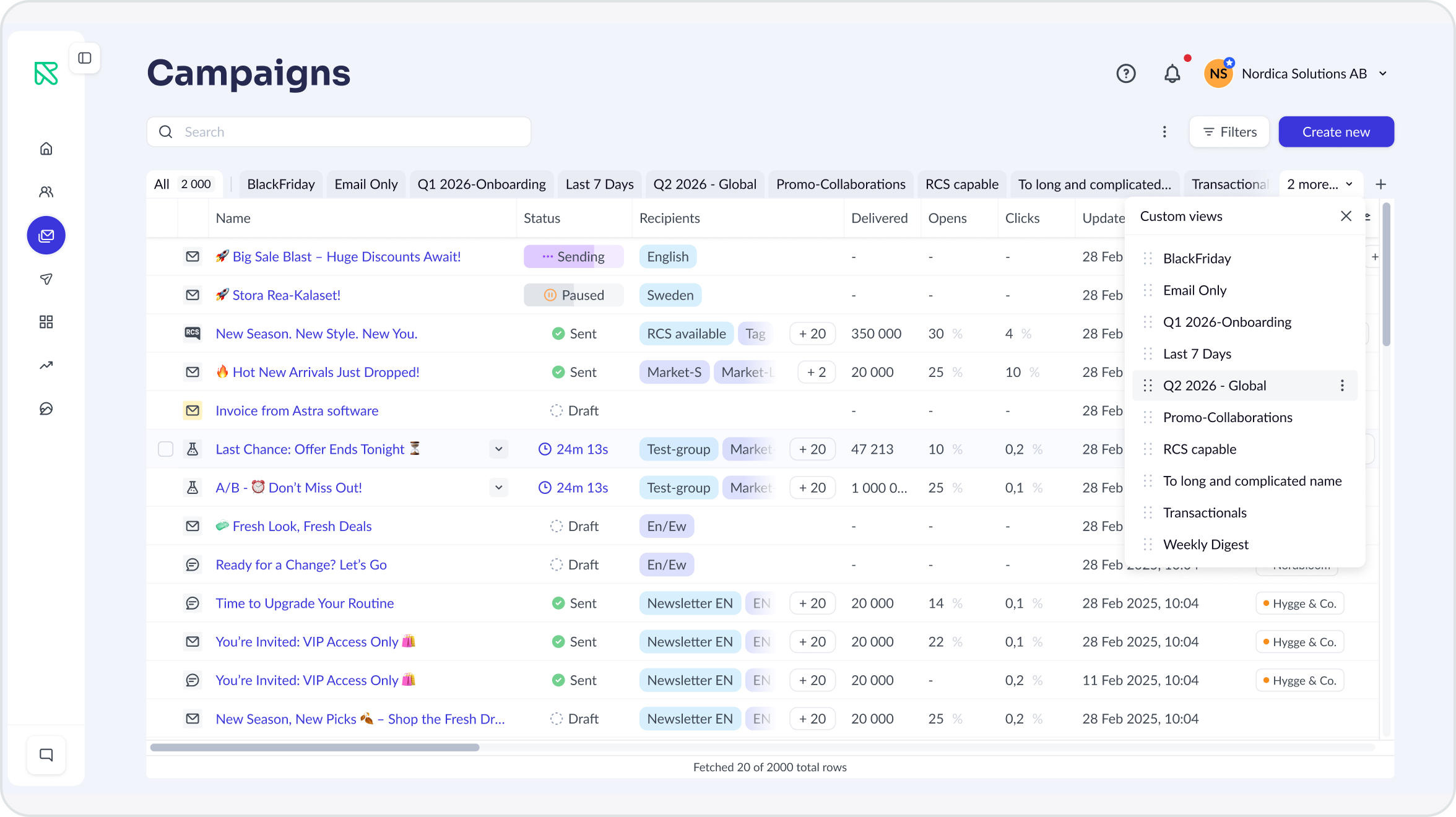
One row of views, a full-width table

Navigation was first designed while folders and fixed default views were in scope. Of four layouts, it came down to two.

The chosen layout: one row of views above the list.
We chose

One row above the list

Compact, and continues the familiar tabs.

We rejected

Sidebar on the left

Holds many views and feels like Gmail, but takes horizontal space away from the table. Once folders left scope, nothing justified it.

Trade-off we accepted

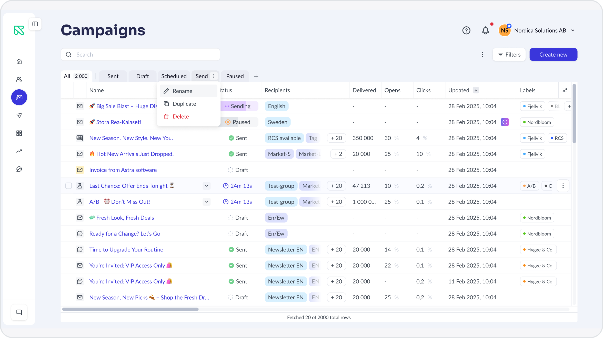
Limited length. Overflow collapses into “+N more”, views reorder by drag and drop, and actions appear on hover since the platform has no right-click menus.

Overflow into “+N more”.
View actions on hover.
02

Sticky controls for wide tables

With auto-fill, one column stretches: the table looks empty with 2–3 columns, squeezed with 6 or more, and users can’t adjust anything.

Shipped: resizable columns; the body scrolls both ways and the header follows its columns.
We chose

Fixed structure

Resizable columns, and room for new ones.

We rejected

Auto-fill width

No horizontal scroll, but unreadable at both extremes and not adjustable.

Trade-off we accepted

Horizontal scroll. Checkboxes and row menus could drift out of view, so the header and checkbox column are sticky, and the row menu appears on hover with a subtle animation.

TipScroll sideways, select rows, open a row menu. Toggle “Highlight sticky areas” to see what stays pinned.
03

Infinite scroll instead of pages

Pagination gives fixed positions, campaign A is always on page 8, but it’s dated and the page switcher costs vertical space.

We chose

Infinite scroll

More vertical space for data, in a continuous flow.

We rejected

Pagination

Filters, sorting and optimistic updates remove the need to remember positions.

Trade-off we accepted

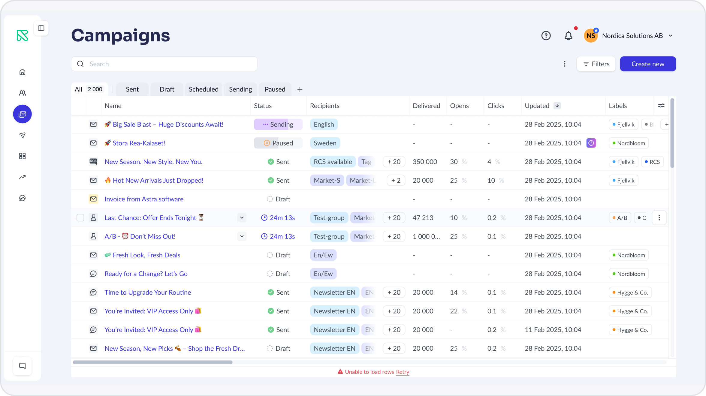
Position is lost after a reload, and new rows must be inserted without reloading. Loading and failures happen inline, without blocking the table.

Loading the next rows.
A failed load, non-blocking.
04

Simple for 99%, not powerful for 1%

Filters exist to find a campaign quickly, not to write queries. Marketers ignore complex interfaces.

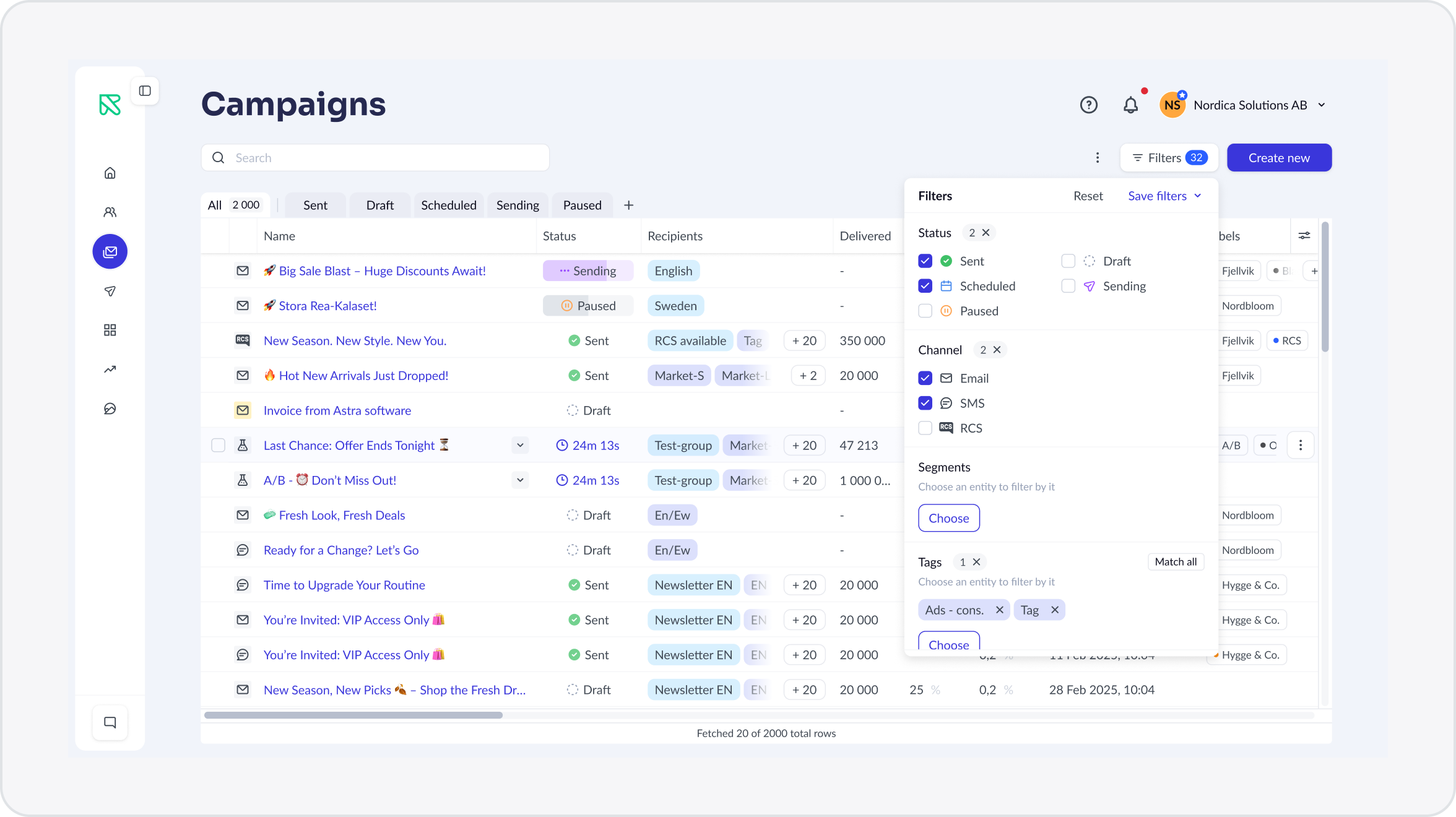
Shipped: flat filters over the list, with grouped slots, counters and Save filters. They apply instantly.
We chose

Flat filters

Fast and familiar. Each filter narrows results on its own, and each group shows a count with a quick reset.

We rejected

Condition builder

Any query with logic and formulas, but high complexity: server load and a long tail of edge cases.

Trade-off we accepted

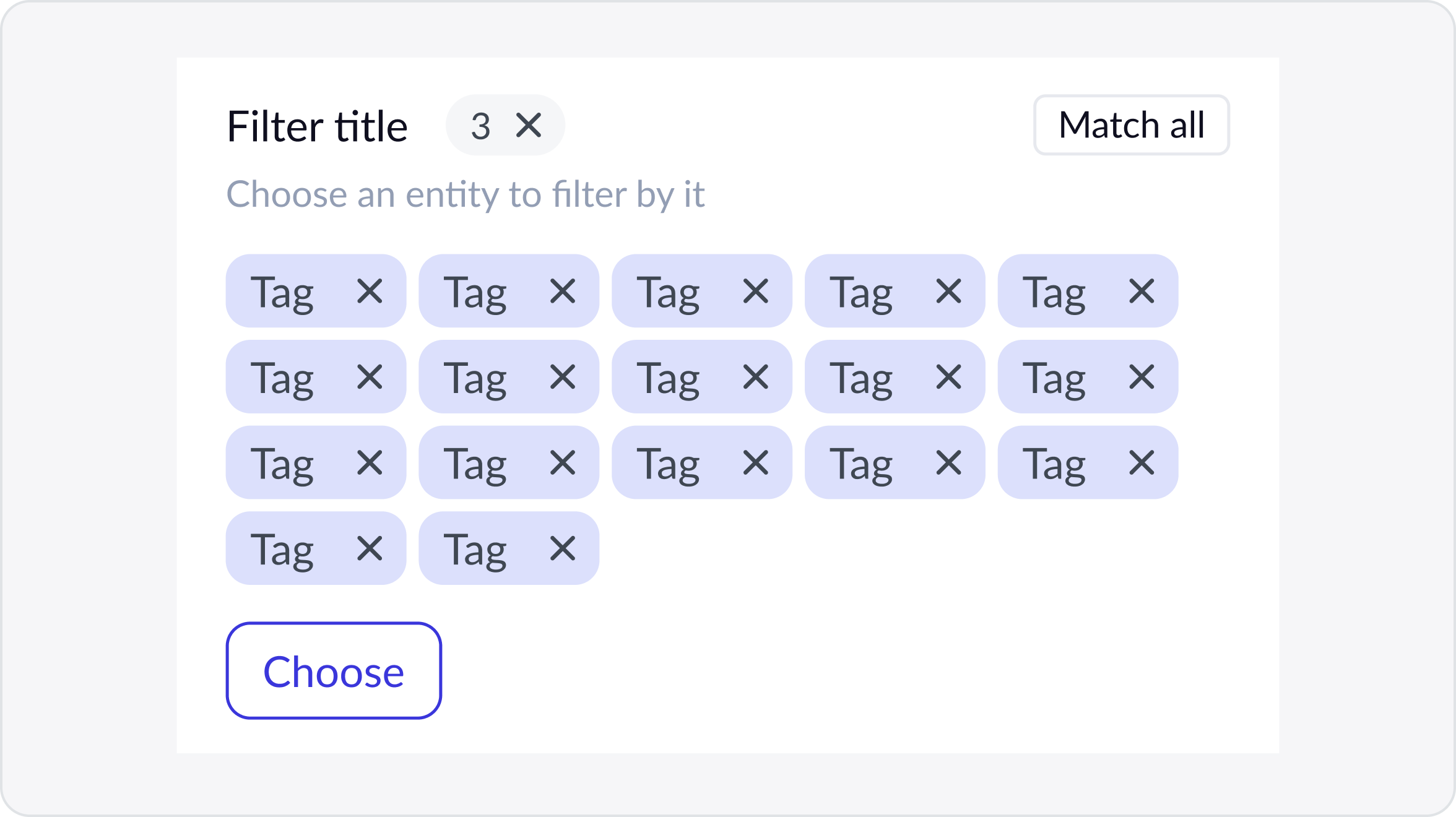
Less flexible. Where AND/OR genuinely matters, a match all / match any toggle appears locally. The backend also shaped the filters: some were dropped, and metrics can’t be sorted.

Match all / match any appears once two values are picked.
05

Labels over folders

We first planned folders and labels later, but handed the call to customer support and customer success. After an internal discussion, they chose labels straight away.

We chose

Labels

Several per campaign, e.g. Promo and Black Friday. A view filtered by a label works like a folder, without the rigidity. Global, created from search with an automatic colour, managed on one settings page.

We rejected

Folders

Intuitive, but rigid: one campaign lives in one place.

Trade-off we accepted

Needs a bit of organising discipline.

The system in detail

Designed for loading, empty and error states

Part of the time a list isn’t showing data: it’s loading, recovering or empty. Every one of these moments was designed, with one rule: tell the user what’s happening, and block as little as possible.

Real-time fuzzy search

Forgives typos, waits 300–500 ms after typing, survives switching views.

TipType in the search box, or tap a suggestion in the dark bar. Try a typo, then switch views: the search stays.

Custom views

Personal presets for filters, sorting and table layout, created from scratch, a template or current filters.

TipClick the tabs to switch presets. Press + to create a view from scratch, a default template, or the current filters, then name it.

Table customisation

Width, order and visibility, saved per user on the server. Name can’t be hidden; widths stay within 50–1920 px.

TipDrag a column’s right edge to resize, drag a header to reorder, and use the sliders icon to hide columns.

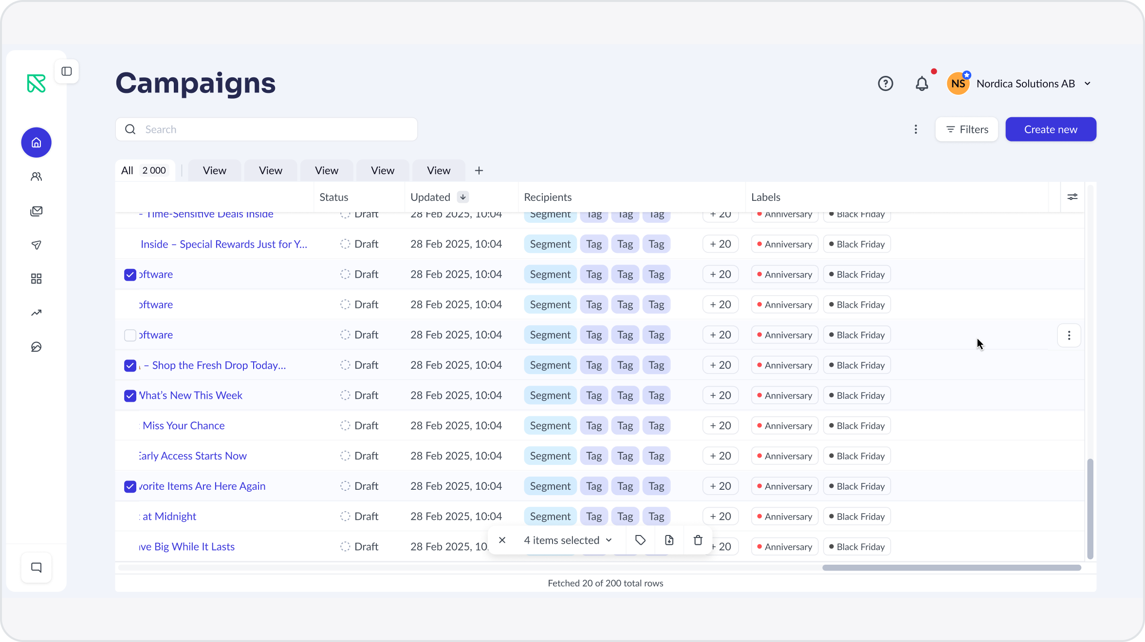
Bulk actions and export

Select loaded rows or everything matching the filters. Export handles mixed selections, since only Sent campaigns can be exported.

TipTick a few rows with different statuses, then press the export icon in the floating bar.

The results

Faster to build, easy to learn

35%

of active accounts created at least one custom view, with 3–4 views each

<1s

list load for accounts with hundreds of campaigns, down from ~6 seconds

3 days

to ship a new list screen, down from 2 weeks, according to the frontend team

0

support tickets calling the new list confusing or broken

Customers wrote in with positive feedback and ideas for what to add next. After launch, the system absorbed a new Unsubscribes column without breaking anyone’s customised table: existing users get it at the end, new users after Clicks.

What’s next

What’s still open

Waiting on the backend

Counters and metric sorting

Counters inside views and sorting by metrics were cut for performance and data reasons. Both come back once the backend can support them.

Designed and queued

Nested rows and bulk labels

Nested rows for A/B tests and bulk label editing are designed and waiting for their turn.

Next case · 02Variants: one campaign for every audience→
Close · Esc