Case study · B2B SaaS · Web

Variants: one campaign for every audience

How we freed customers from dozens of near-identical automations and built personalisation into a live platform, without breaking the campaign interface they already knew.

RoleDesign lead
Team · 6 people
APKTSJOGVYS

TimelineFeb → May 2026
Key result2,400+ duplicate automations removed
Variants list and card
01 · The problem

20 automations for 20 languages

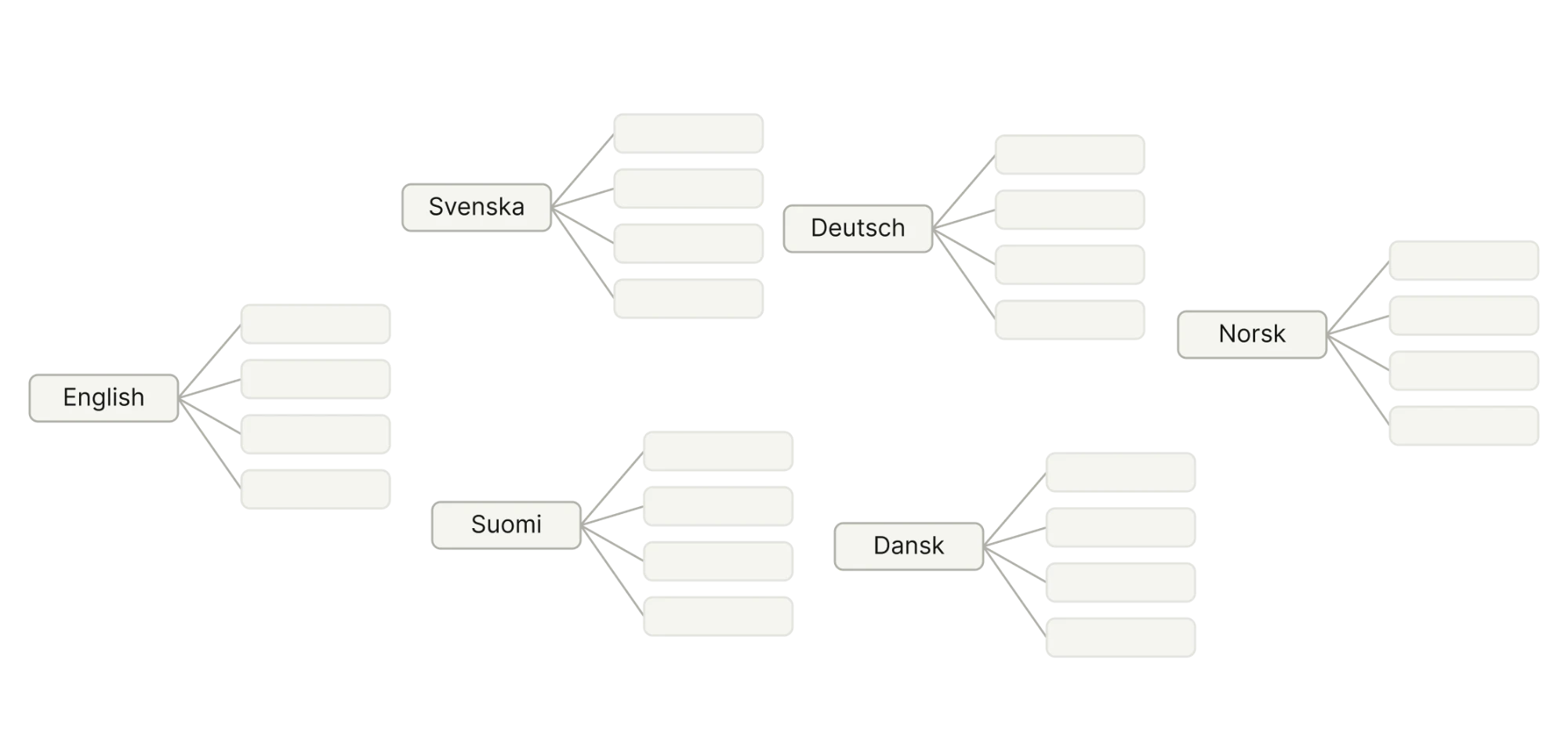
Several customers kept 20 automations that differed only by language. An automation holds several messages and settings: a trigger, conditions, delays, events. Every copy meant repeating the same manual setup, and every change had to be made 20 times.

Campaigns had the same problem: audience, UTM tracking, unsubscribe links and schedule were filled in again and again, even though the data was identical everywhere.

Before · 6 automations, 6 identical setups
Every automation repeats the same trigger, conditions and delays. Only the language differs, and any change has to be made in every copy.
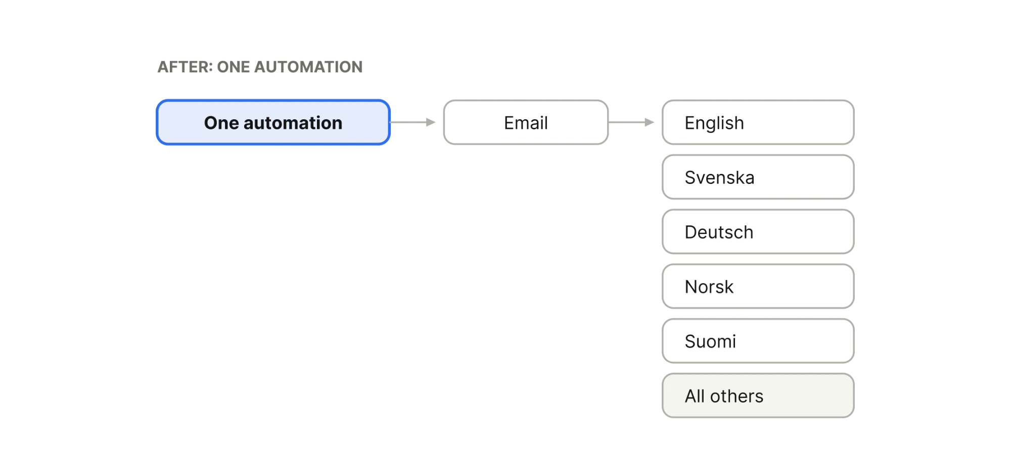
After · 1 automation holding all 6 messages
The trigger and settings are configured once, and every message inside the automation works the same way.
02 · The idea

Reuse the switches pattern

We needed one more layer at the dispatcher level, the campaign, the automation or the transactional message: one set of sending settings, with the content changing depending on the audience. A variant’s condition can be any segment or tag, so variants solve more than the language problem.

The platform already had a similar mechanism: switches in the email editor, where the same section looks different for different audiences. We reused that pattern’s structure, an ordered list, drag and drop, a condition as a chip, a locked default at the end, and built variants as their own block with its own icon and controls.

If people understood switches, they recognise the same shape in variants, and the other way round. The two features reinforce each other, including in our learning material.

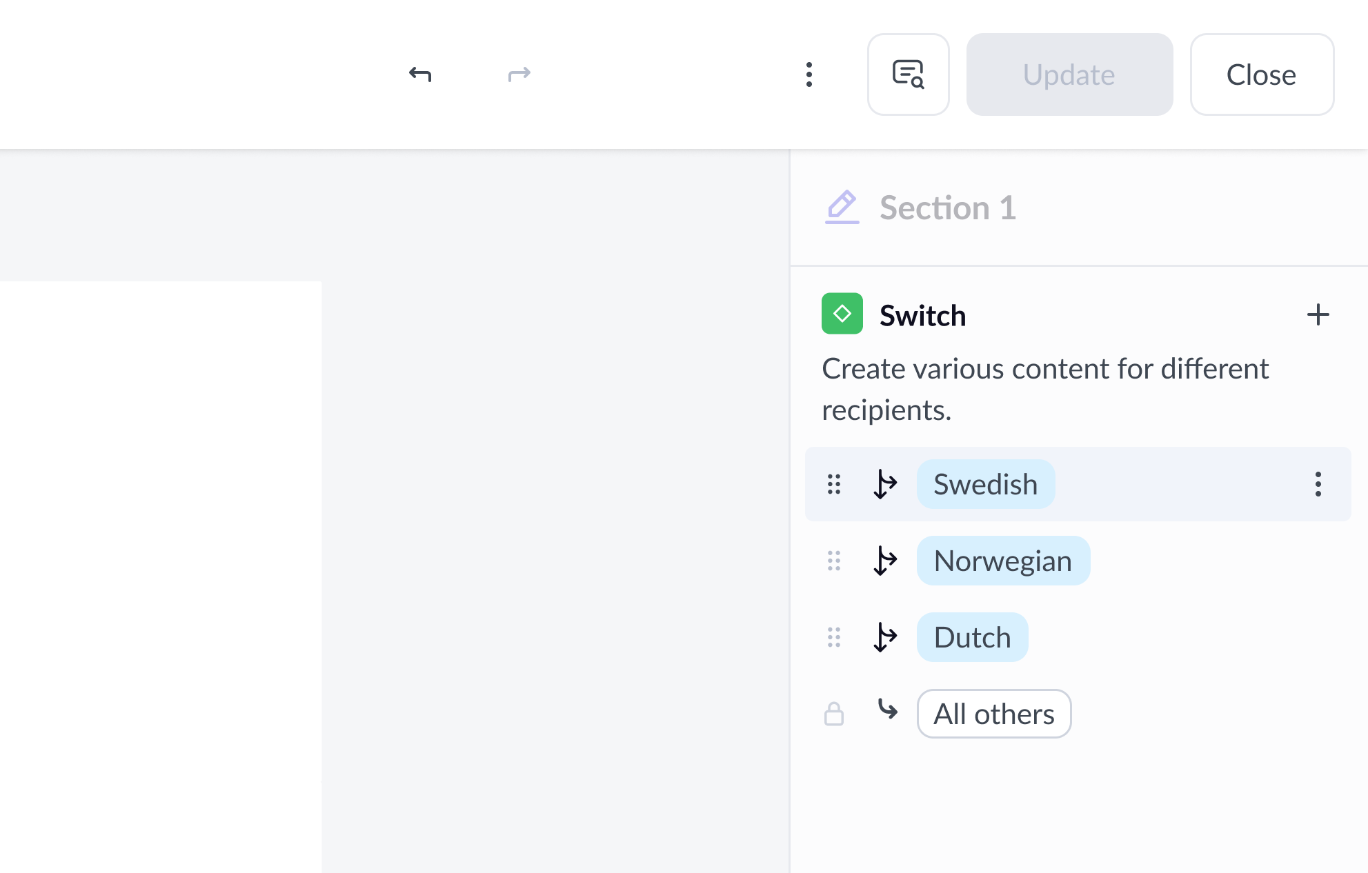
The Switch panel in the editor sidebar: the ordered list, the condition chip and the locked default row that Variants echoes as its own component.
03 · What we shipped

One campaign, many emails

The campaign now has a list of variants: separate versions of the email, each with its own template and, if needed, subject, sender, pre-header and UTM. Audience and schedule stay shared at campaign level. Each variant gets a condition, a tag or a segment. Anyone matching none of them gets the default, All others. Variants are checked top to bottom, and the first match wins.

For the customer with twenty language automations, that’s one automation with twenty variants. The same module works across campaigns, automations and transactional messages, in email, SMS and RCS.

04 · Anatomy

A list and a card

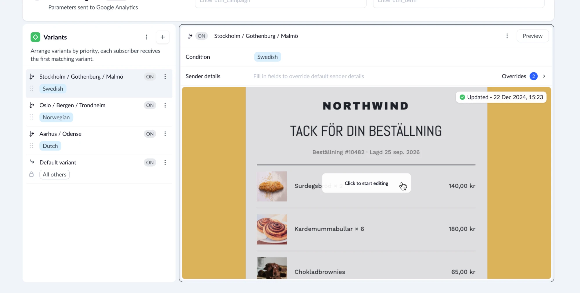
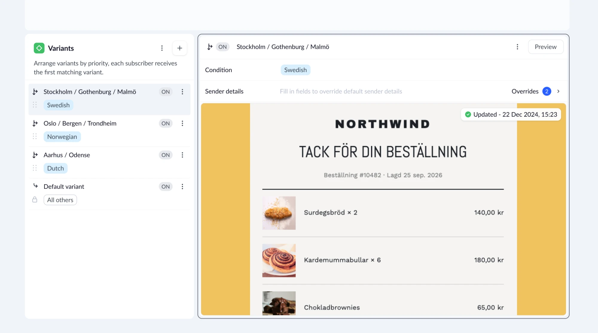
The full screen: the list of variants on the left, the selected variant’s card on the right, with its condition, sender detail overrides and the email preview.
The list

Every variant at once

Each row is one variant: the name, the condition chip, the branch arrow, the on/off toggle, the drag handle and a menu with copy, rename and delete. “+” adds a new variant below the selected one. All others closes the list, with a lock instead of a condition.

The card

One variant in full

The header repeats the name, condition, toggle and menu from the row. Below sits a collapsible sender details panel, then the email preview with the same “Click to start editing” hint as a regular campaign.

05 · Decision

No new campaign type

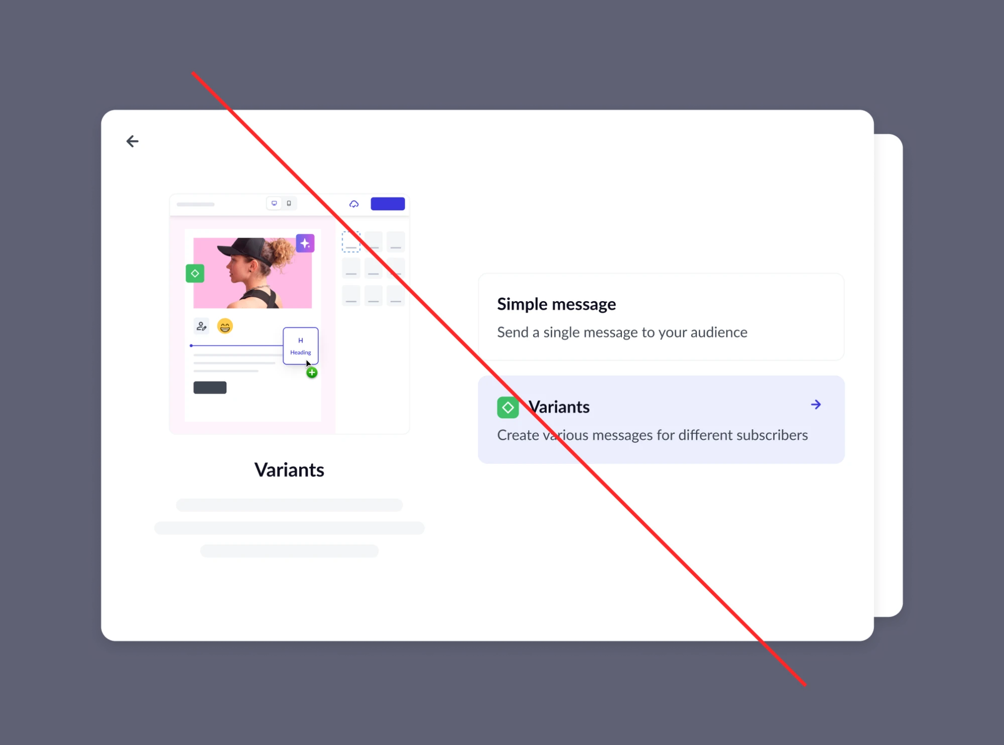
The simplest route was a separate entity, a “campaign with variants”. But then the choice would have to be made upfront, and an existing campaign would have to be rebuilt from scratch, exactly the manual work variants are meant to remove.

Rejected · choose a type at creation
Early mockup: a modal asking the user to choose between a regular campaign and a campaign with variants.
Shipped · transform in place
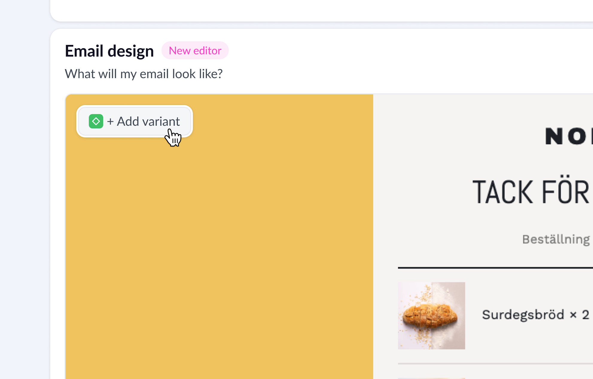
Clicking Add variant turns the Email design block into a list and a card, and the email stays where it was.

An Add variant button appears in the Email design block. The current email becomes All others, and the new variant is created as its copy, so the user starts from a finished email and changes only what should differ. It’s reversible: delete every variant and the campaign is regular again.

The change works both ways

Regular campaignOne email and its settings
Add variant
Every variant deleted
Campaign with variantsA list of variants and a card
  • The email becomes All others
  • The new variant starts as its copy
06 · Principle

Add, never move

Variants land on screens customers use every day. If the familiar shifts after one click, people lose confidence and the appetite to try something new. The rule: everything that existed stays where it was and behaves the same way, and the new only gets added.

The path to editing stays where it was

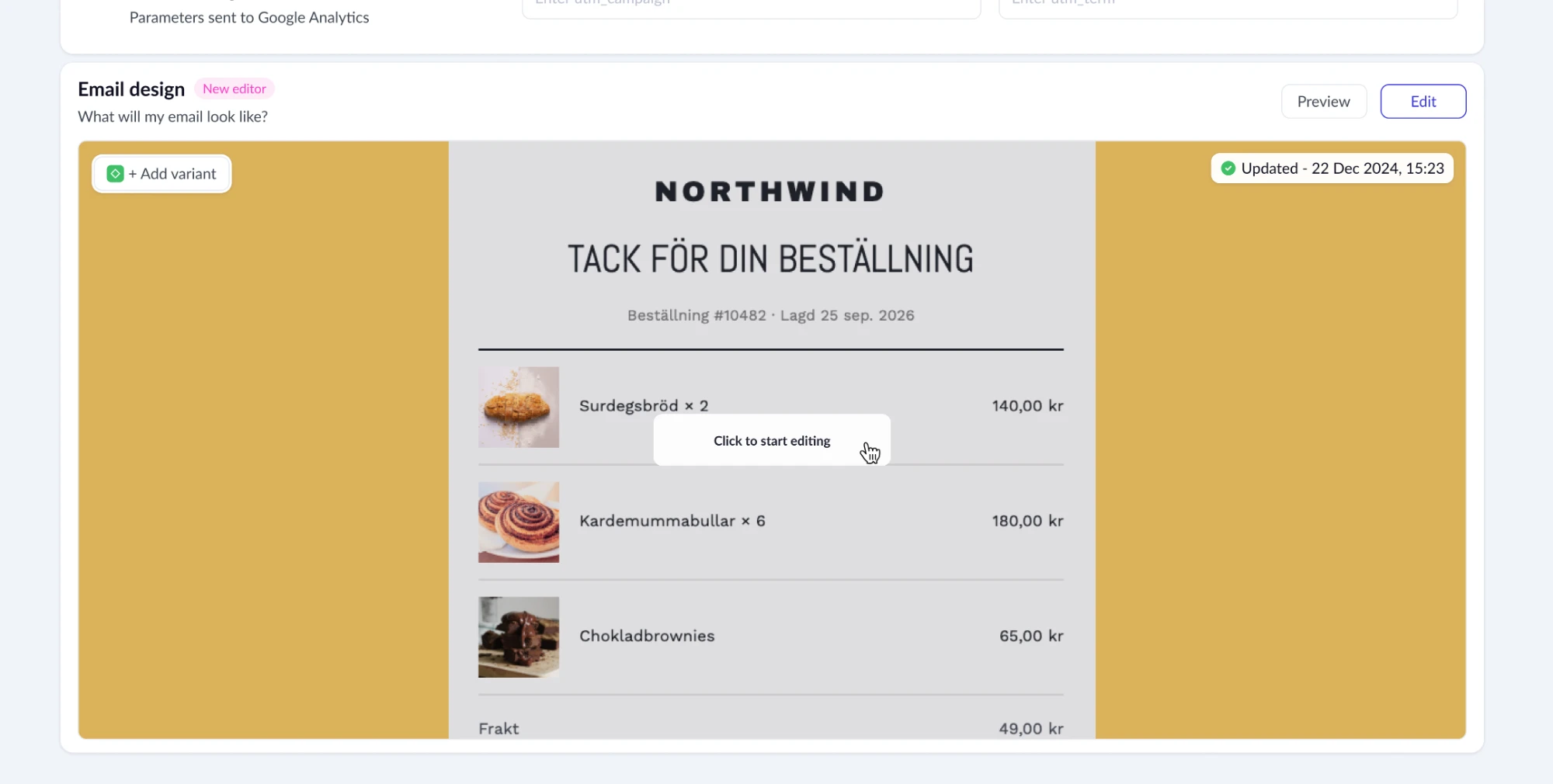
The preview is the same component with the same “Click to start editing” hint, in a regular campaign and in a campaign with variants.

A regular campaign: the hover on the mini preview.
A campaign with variants: the same hover on the selected variant’s preview.

An isolated module, no redesign of existing UI

Variants had to appear in a regular campaign, every version of an A/B test, automations and transactional messages, across email, SMS and RCS. So they’re a self-contained module that sits exactly where the message block used to be. Differences are allowed only where the channel dictates them: in SMS and RCS the card has a different editor and a message part counter. Variants are learned once and recognised anywhere.

A backend constraint turned into loading states

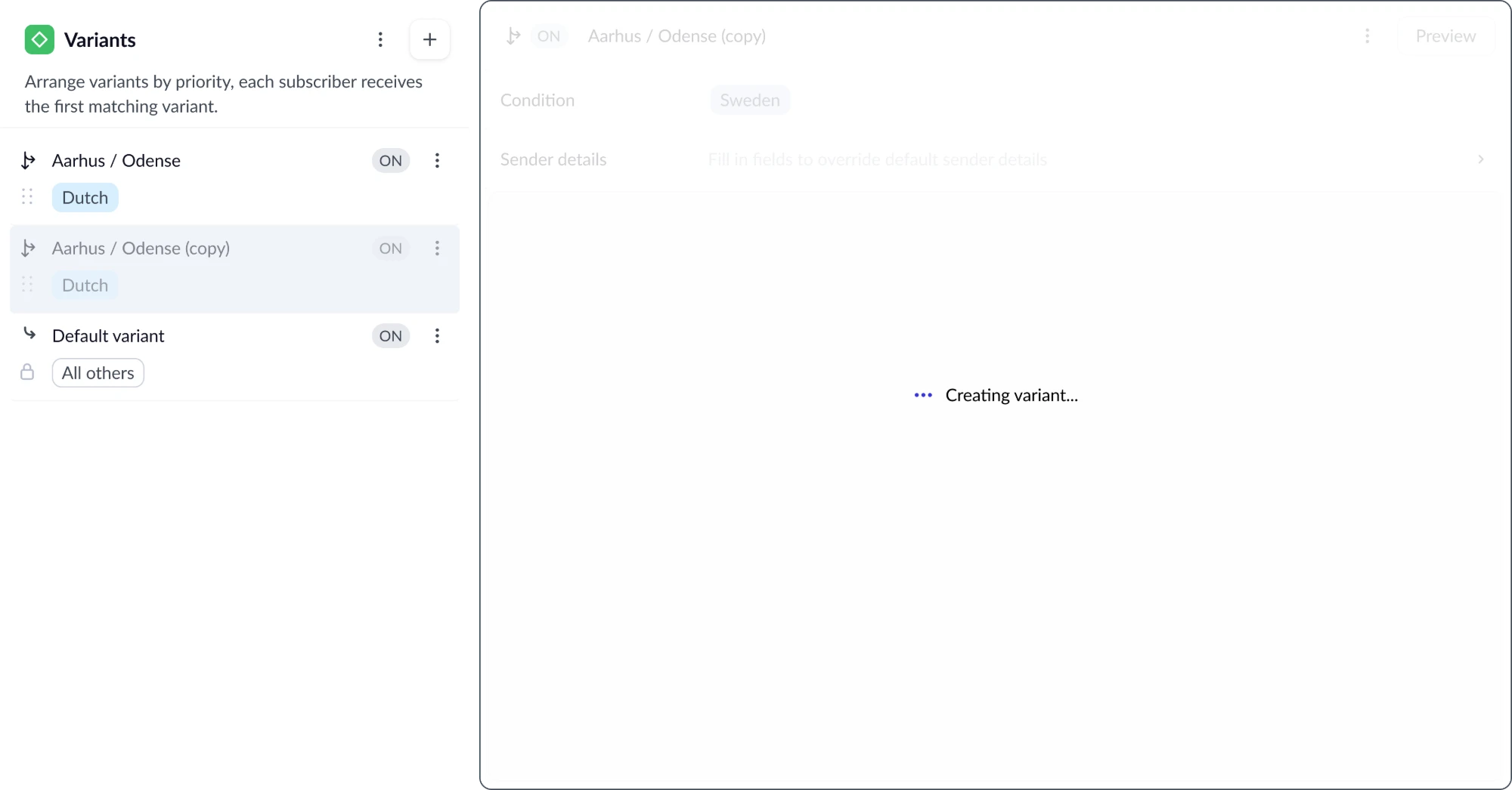
A variant isn’t created instantly, and the server won’t accept changes on top of it mid-request. The waiting lives only where it starts: the row appears immediately, the card shows a “Creating variant…” skeleton, and the rest stays usable.

Creating a variant: the row appears at once, the card shows a skeleton, then the finished variant.
07 · Decision

Recognised by the email

People tell variants apart by context: how the email looks, its template, subject and sender. It would have been more compact to keep only the list and move editing to a separate page, but then telling variants apart means opening each one. So the selected variant’s card is always open next to the list, exactly as with switches.

Editing on a separate page

A click on the name opens another page.

  1. Stockholm · Sweden
  2. Oslo · Norway
  3. Berlin · Germany
  4. All others

The list shows only names and conditions.

The list and the card together

Select a variant and see its email.

  1. Sweden
  2. Norway
  3. Germany
  4. All others
email preview

Template, subject and sender are visible.

08 · Decision

Built for twenty variants

A row of pills above the editing area was the first idea: compact and familiar, like tabs. But the case this started with is twenty language versions. Twenty pills wrap onto several rows, names get truncated, and finding one becomes as hard as finding the right automation among twenty copies. A vertical list handles three and twenty equally well, and it repeats the switches pattern from the editor.

It had one more property that mattered most in the end: it reads top to bottom, like a queue.

Grid of pills

1 Sweden2 Norway3 Germany4 Denmark5 Finland6 Netherla…
editing area

The order is unclear once the row wraps.

Vertical list

  1. 1Sweden
  2. 2Norway
  3. 3Germany
  4. 4Denmark
  5. All others
variant card

Top to bottom, All others last.

09 · Decision

Same actions, two places

The toggle, the condition and the menu live both in the list row and in the card. In the list the user looks at all variants: checks the order, switches off a seasonal one, spots one with no condition. In the card they work with one variant. If actions lived in only one place, half the scenarios would force a detour. Both show the same state, so switching a variant off in the card switches it off in the list.

10 · The hard part

First match wins

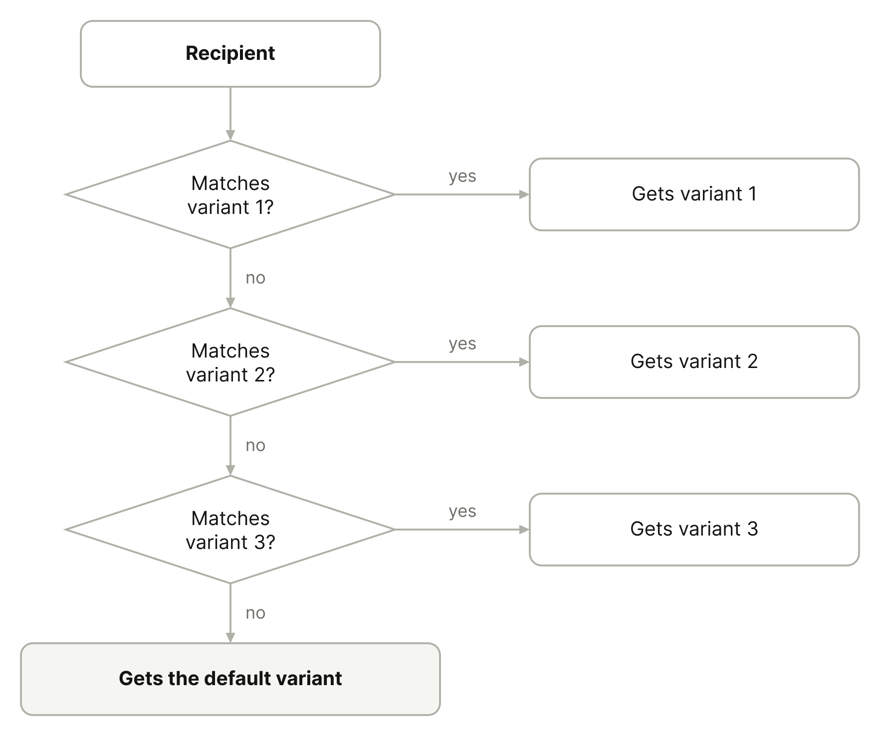
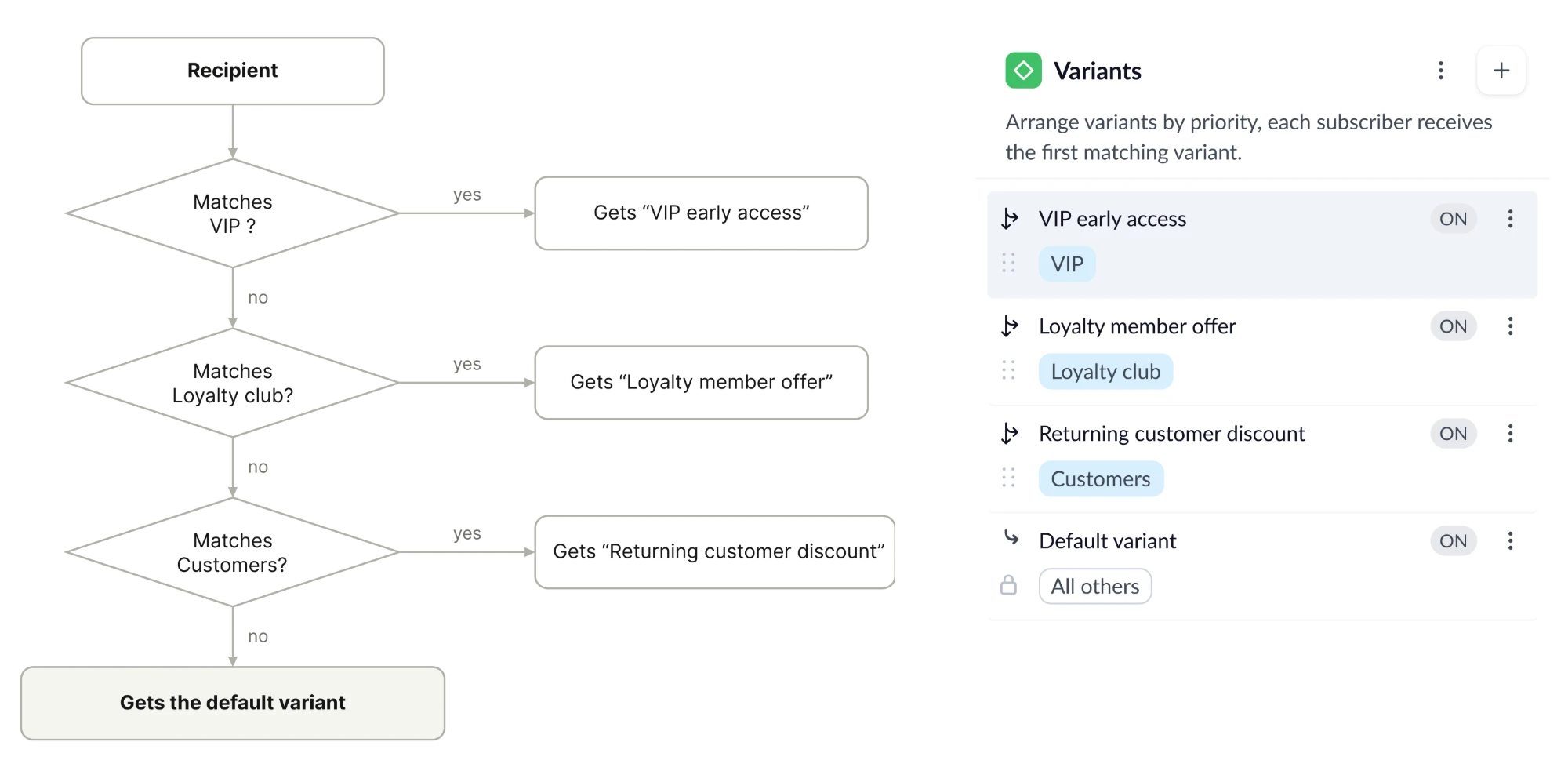
One recipient often belongs to several segments. We picked the rule that’s simplest to predict from the screen: variants are checked top to bottom, the first match takes the recipient, and anyone matching nothing gets All others, which can’t be deleted or given a condition and always sits last.

Variant selection logic: top-down checking and the default variant.

Example: a seasonal sale

VariantWhoWhat they get
VIP early accessVIP segment, the most valuable customers−30% and access a day early
Loyalty member offerLoyalty club segment−20%
Returning customer discountCustomers segment, bought at least once−15%
All othersDefault, subscribers with no purchases−10% on a first order

Every VIP is also a loyalty member and a customer, so they match three variants. The order guarantees they get the best offer. If Returning customer sat above VIP, the most valuable customer would get −15%. The rule only works if the order is visible, so every decision below keeps the queue visible and stops it changing unnoticed.

Arrows that explain the order

Every row starts with an arrow pointing away: the rows aren’t equal menu items but points where the send splits. A number would say “just a list”, a checkmark “enabled”, an audience size “how many people land here”. None explains why someone matching two conditions doesn’t get two emails. An arrow to the side reads as a diversion: whatever leaves doesn’t travel on.

Branch icons, the drag handle, the lock on All others.
The rule, stated under the heading: “Arrange variants by priority, each subscriber receives the first matching variant.”

Priority changes by dragging, from anywhere on the row. All others is locked last, so the queue always ends with a variant for everyone.

Errors in the same spot

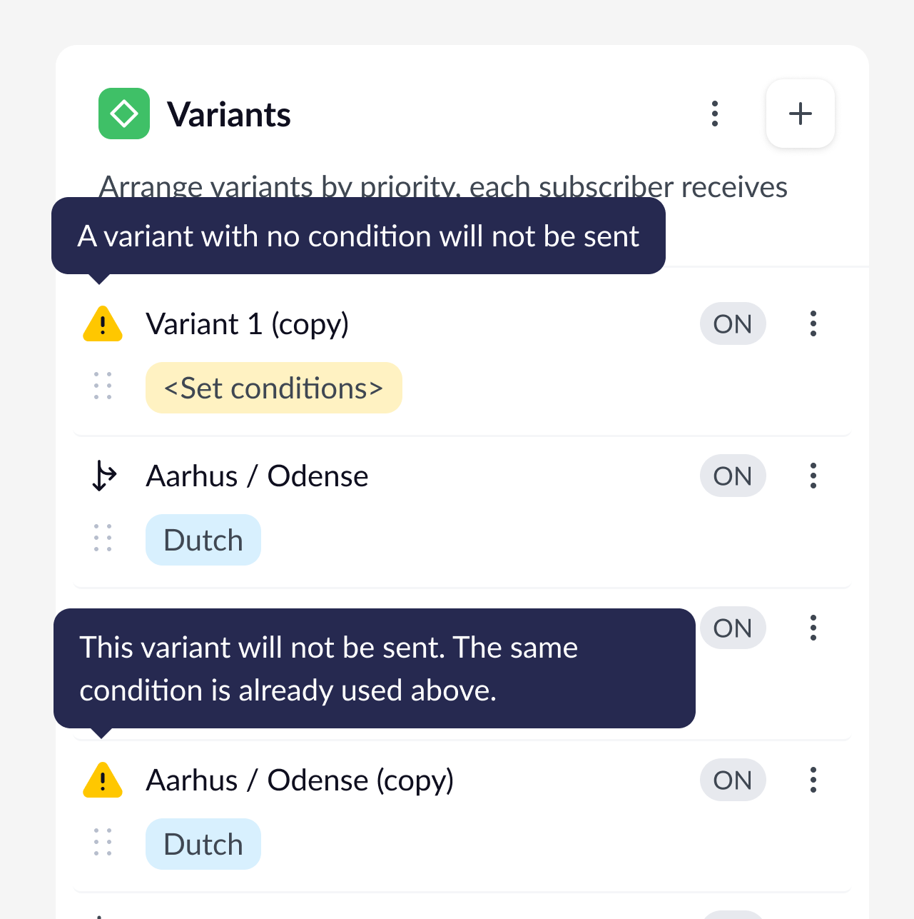
A variant gets no recipients in two cases: no condition, or the same condition already sits above. Then the arrow turns into a yellow icon with a tooltip that explains why. Yellow appears nowhere else in the list.

A variant with no recipients: yellow icon and a tooltip explaining why.

Switching off instead of deleting

A seasonal variant can be switched off and brought back without losing its template and settings. It keeps its place in the queue, so priorities don’t need rebuilding.

11 · Data model

Inherit, then override

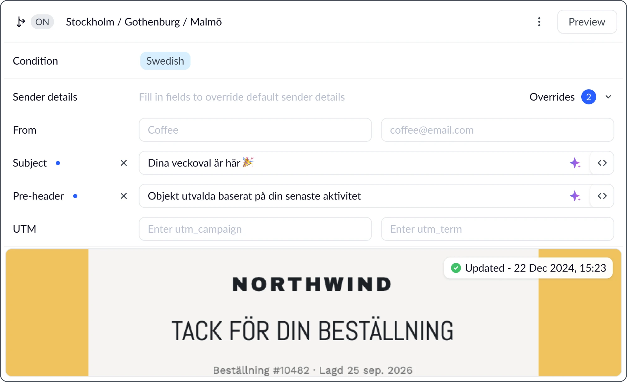
Subject, sender, pre-header and UTM were also filled in again in every copy. We followed the data model: the campaign block becomes Default sender details, “applies to all variants, override any field if needed”. Fields in the variant stay empty and show the defaults as grey placeholders. Change the subject at campaign level and every variant without an override picks it up.

An override is visible at once: a blue dot next to the field, an Overrides counter, and a cross that resets to the default in one click. The panel remembers if it’s expanded, so comparing subjects across variants takes no extra clicks.

Overriding the subject in Swedish: the blue dots, the Overrides counter, and the cross that resets each field.
12 · Onboarding

Quiet onboarding

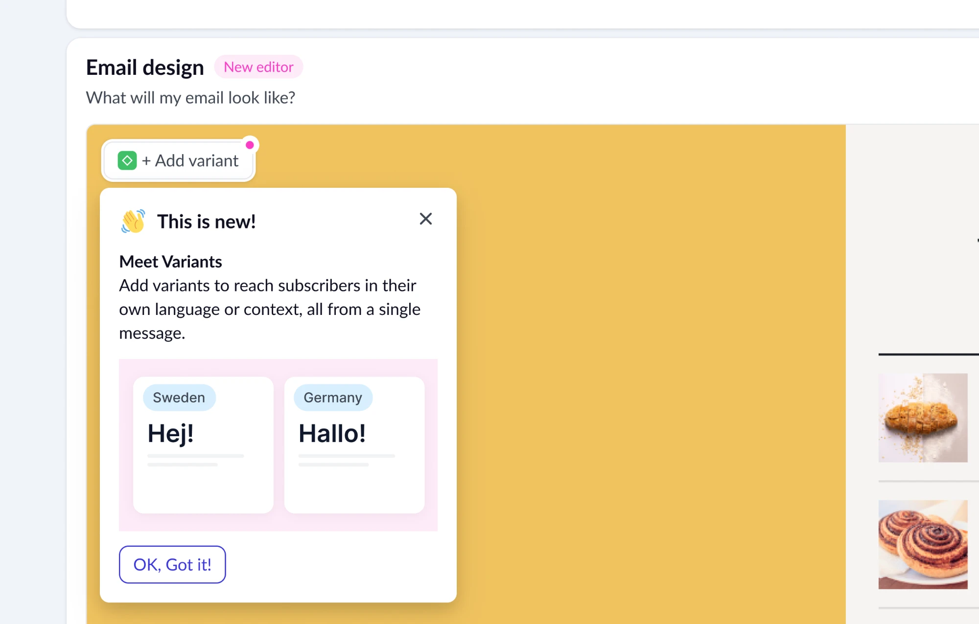
People open a campaign to send a broadcast, not to study a feature, so nothing intrusive. But variants carry logic nobody can guess: the order and the first match. The feature is announced by a glowing dot on Add variant and a short popover, with no modal on top of the work.

The dot and the popover: two emails, “Hej!” for Sweden and “Hallo!” for Germany, so the value reads in a second.

The guided tour opens only on the first click on Add variant, once the user has shown interest. Two of the four steps go to the order and to switching off, the parts nobody works out from the screen alone. The variant is created in the background while the tour is read, and the hints never repeat in other channels.

TipClick “Add variant” to launch the tour. Use Continue, Back or the arrow keys. The variant is created behind the tour.
Results

Fewer automations, better targeting

20 → 1

automations for a customer sending in 20 languages

2,400+

duplicate automations removed across customers
−38%

trigger processing time, with fewer automations to evaluate

+18%

revenue per send on localised variants vs one generic email

What’s next

Deliberate scope

Next

Conditions inside the variant

Today a condition is an existing tag or segment. Next is a simple rule set right in the variant, like “language = English”. V1 stopped at tags and segments to ship faster on objects users already know.

Left out

Signup forms

A different scenario, and no analytics there, which is where variants are most useful.

Previous case · 01One list system for the whole platform←
Close · Esc